As I am from the point and shoot era, learning on a old style film camera, I quite often forget about all the special features that smart phone cameras have on them. And as someone who has picked up the travelling bug, I should remember the Panorama button on my phone way more than I do! But once I do remember, the photos can be spectacular, memorable or just plain fun. And if you do forget that button, I have a tip for turning a series of photos into a panorama like layout.
To get started I find that panorama photos tend to be the highlight of your page so you definitely do not want to crowd them out with too many patterned papers or busy elements – so for once I will keep it simple!
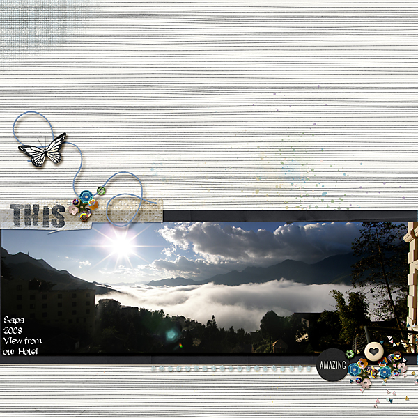
Horizontal Photo
The classic! Keeping to the rule of thirds is also something to keep in mind as your panoramic photo will tend to take up the width of your page and it will look far better balanced placed towards the top or the bottom part of your page. My elements are on the diagonal and highlight the slope of the mountain on the photo. The background paper has a lovely subtle horizontal strip that works so well with the long photo.
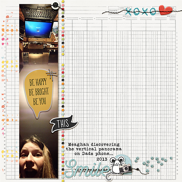
Vertical Photo
Ok, this is one I never think to do. My daughter was playing with her phone and came up with some fun and unusual selfies, just an ordinary day. Just turn your phone on its side and panorama away! You can have a lot more fun with your page on this type of photo, especially if it an indoors photo as there is often a great big space of nothing in the middle - so good for placing a quote or a bright element!
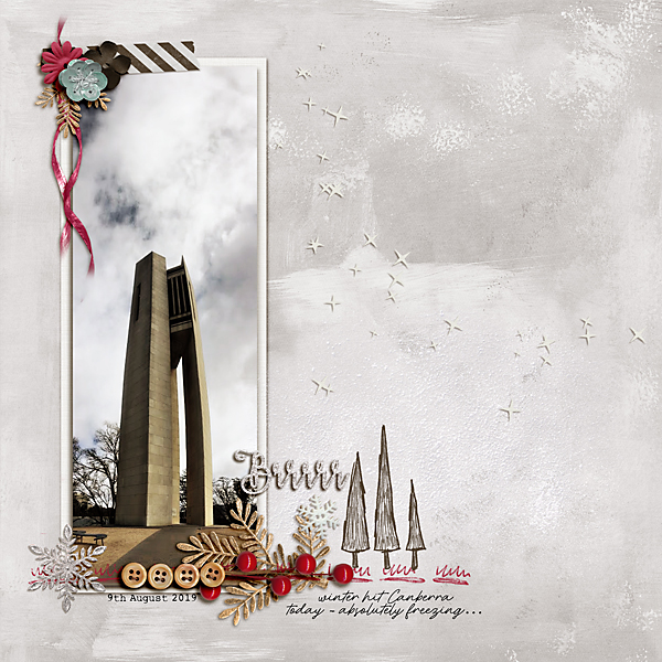
This is good for tall buildings and big beautiful trees as well. You have to be mindful of the distortions that can happen - but they can also result in some very fun photos as well – I have one where my husbands beanie is stretched out to about half a metre from his head – looks like a long elves cap! You can see a bend in this building but I'll just say it's an artistic look!
Fake it!
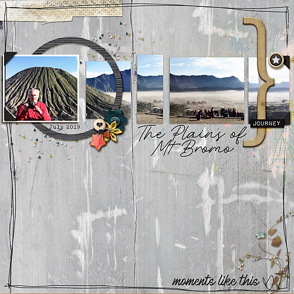
So you’ve come back from your holidays and haven’t taken that one wonderful vista because you forgot the panorama feature – this happens to me all the time! You have however taken a number of shots from that one location and although they don’t quite line up, they need to be seen together. This is where a template can come in handy. It allows you to insert a number of different photos but break them up in a natural way, tricking the eye into thinking it is one photo – I have used 4 different photos on my page below. If they don’t quite line up, the a conveniently placed element (like the ampersand and the circle) can be used to cover up the small imperfections. I have used one of the templates from the Reflections set here but there are many others out there that are suitable.
Multiples
Sometimes the panoramas are just a little bit dull or you have taken a heap of them but don’t want them on every page you do – stack them up and use them for a title page on your photo book. It is a very quick page to create but gives the reader a nice feel for the rest of the book.
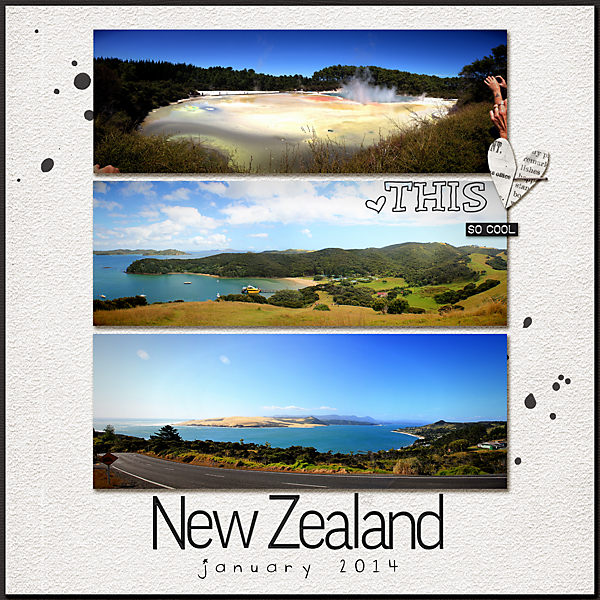
So get out there and take some fun Panorama shots, it's not that hard and scrapping them is so very easy - they practically do it themselves!


No comments:
Post a Comment
Note: only a member of this blog may post a comment.