Showing posts with label affinity. Show all posts

Sunday, 13 September 2020

TUTORIAL | BASIC BLACK & WHITE EDITS IN AFFINITY PHOTO


Over the past several months, I've shown tips about using the Affinity Photo program to scrapbook digitally. While we digiscrappers always look for ways to use new programs for our hobby, it bears demonstrating that Affinity Photo can also be used as a photo editor, what it was really created to do. One of the simplest and most common edits we want to make to our photos is to convert them to black and white. We've gotten used to accomplishing those tasks easily with presets for Lightroom or specific adjustments in PS or PSE. The process is also super easy in AP. And like in other editors, there are several tried and true methods to get the job done.


The obvious first step is heading into the Adjustments Studio. Clicking there brings up ALL the adjustment choices to scroll through. You can also hit the arrows near the top and get access to groups of adjustments for specific purposes, like Black & White and Exposure. 
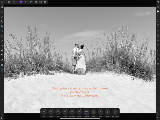


When I click Black & White under Adjustments, it comes out pretty well. All of those sliders in the context menu can be tweaked individually to fine tune my results. If I adjust the opacity, I can get a sort of pastel desaturated version of my photo. If I tweak the color sliders I can achieve almost a sepia tone.

If you want to save an edit to recreate it later, just add it as a preset.

Adding an HSL (hue saturation luminance) adjustment is another way of making a photo black & white.


At the core, a black & white photo is desaturated so I can take the saturation all the way to -100%. But I can also adjust the other two sliders to customize to my preference.

A gradient, most specifically a black to white gradient, is another great method for black & white conversion.

The default gradient is really bright! I'll need to adjust the three gradient points to black, gray and white.


Changing the gradient points is fairly intuitive. I click each of the gradient circle points, make sure it's reflected in the color circle and then select the color that I want for each from the color wheel. For a straight black & white conversion I can also delete the midpoint keeping only the two end gradient points.


 One last option for black & white conversion is to Recolor. Like before, changing all the options to zero will desaturate the photo. Then coming back and tweaking them individually will let you tighten up the edit.

Once you've added one of the above adjustments you can always duplicate the layer and change the opacity and/or the blend mode to deepen or lessen the effect. You could also add a brightness/contrast adjustment or an exposure adjustment to deepen the darker colors if you wanted.

I hope I've given you a little taste of the editing engine inside Affinity Photo. We'll dive a little deeper later.

_________________
Stacia

Tuesday, 2 June 2020

TUTORIAL | EXPORTING IN AFFINITY PHOTO

I've seen a lot of our scrapbooking friends use this stay-at-home time to expand their skill set, with a lot of digi beginners dipping their toes in the pond. With a nice sale by Serif, the parent company for the Affinity products, we're seeing some new faces in our digi forums. For those scrappers new to the Affinity Photo app for digital scrapbooking I thought it could be helpful to go back and hit a few basics. So many functions are the same yet just accomplished in a slightly different manner. I’ll be using the app on my iPad.


To create a new document, you’ll click the + button at the top right. It will bring up this screen. If you’ll be starting with a digital template, I recommend using the Import from Cloud option. Once you click it, it will open a selector where you can choose from your iPad, DropBox, Files, or anywhere else you've chosen to store your files. Note that Open from Cloud will change your original file. Great for editing photos, not so great for being able to reuse a digital template. To create your page from scratch, choose New Document.


Generally you add papers and elements to your page using the three dots at the top left and choosing Place from Cloud. I like to be able to see my options more easily. So if you drag up from the bottom of your iPad screen you'll reveal the dock. When you have the Files app in the dock you can hold it with your finger and drag up and over to one side. It kind of docks it over there. You access it by swiping from the center of the side of your iPad screen when a little arrow shows up. Now you can drag and drop your elements right onto your page without the separate step of placing them individually.

Also note that to periodically save your layout while you're working you click the top left hand corner back arrow. This takes you back to the home screen and saves your page. Then you just go back into it. I'll share a tip that occasionally Affinity Photo has just dropped out requiring me to reopen. At the beginning, I might lose part of my work. Now, I'm careful NOT to have too many apps open at once that use memory and I make sure my iPad storage is good. I also decreased my Autosave Interval (under the gear icon preferences general tab) to the minimum. Nobody's got time to redo things!


I learned from a fellow app scrapper that you can also have your photos app docked at the same time. They sort of nest together over there and you swipe the bottom left one of them to switch between. You accomplish that the same way by swiping up to access the dock, dragging Photos up and over to the side.


At one point when I'm clicking the back arrow to save my page, I'll use that opportunity to rename the file to my layout's name, usually when I've picked the title. You click the three arrows on the right of your page thumbnail and select rename from the choices. It brings up a box where you delete the characters that are there and replace with your title and select OK.


Once you're finished with your page, go up to the Documents icon and select Export. I usually save my print version first to make sure that gets done. My default screen comes up as 3600x3600 pixels (because that's the size of the template I started with) as a jpg and at 100% quality. Note the large file size, this should print out just fine. My naming system is that I add -p to my print size files. Then I click OK and save it in Files in a separate folder strictly for print files. That makes it easier to find when I'm ready to upload pages to Persnickety Prints.


I can also choose the Share option at the bottom left. This gives me the options to save in Files and Dropbox just like OK does but it adds many more choices. I could AirDrop to my iPhone, send it via message or email, save it to my camera roll or send to social media.


Next it's time for the web sized version. Same way, select Export, but now we'll change the 3600 size by either tapping and using the little calculator or swiping the circle (the calculator option is the easiest for precision). I'll select 600x600 as that's the size most used at The Lilypad. I'll also add -600 to the file name to denote a web version.

Then I would tweak the quality slider a bit, usually between 93% and 97%, to get the file size at the bottom less than 250kb. Then, click OK and save it in a separate folder called web size layouts. Having that separate folder makes it easier to find when posting pages to online galleries.


But as you'll notice in this example, I can't reduce my quality enough to get that size under 250kb. This doesn't happen often but often enough to need a workaround. One choice is using Flickr. I use Flickr as the method for hosting images to share in CT forums. But it does offer the option of sharing files via email with optional photo quality sizes. So I'll upload the print version to Flickr and go in and see if one of those options gives me a file size small enough.


Another option is to use the legacy Save for Web feature in Photoshop. For those that have scrapped for a while, we're used to having the opportunity to see the file size when saving. You access the legacy feature on a PC by clicking Cntrl + Alt + Shift + S. Now I'll reduce the height & width to 600 and tweak the quality slider. Voilà, a page we can post in a gallery!

If you're new to app scrapping I hope these beginner tips were helpful. Is there anything else you'd like to learn? I would probably like to learn it too!

_________________
Stacia

Tuesday, 5 May 2020

TUTORIAL | ADD SOME DIMENSION IN AFFINITY PHOTO


One of the things that I miss now that I’m trying to scrap solely in Affinity Photo is the ability to use Photoshop styles. One click and poof, you can accomplish almost anything it seems. So I thought I would spend some time in the AP Layer FX Studio and get more familiar with the tools I do have available so I can make them work for me. Today, we’re going to learn more about Bevel / Emboss.

You access the available layer styles on the right side by clicking “FX”. I’ve gathered up an assortment of flat elements to experiment with and see what can be achieved when looking for added dimension as opposed to strictly a drop shadow.

Having Scale with Object up at the top selected will ensure that any effects you add will change proportionately with the size of the element if you shrink or enlarge it while scrapping.

There are four types of bevel/emboss - inner bevel, outer bevel, emboss and pillow emboss. All of them will add a rounded edge to the element to some degree. The radius determines the extent of the rounding effect and can be linked to the depth of the effect (or unlinked). The soften option affects the look of the shadows and highlights along the edges. Azimuth determines the direction of the light source.

If you click the little arrow, more icon choices will be available. Profile determines how the light is applied around the edges of the element while invert will quickly reverse the light choice made. You use the enable selection to turn these options off and on.


Inner bevel applies the rounded bevel on the inside, outer bevel to the outside and emboss to both the inside and outside of the element. Sometimes a straight comparison is helpful. Here are all four options with the same depth/radius and no other customizations. Obviously, these are pretty harsh.
Let’s go back to inner bevel. Soften does as you might anticipate, softening the harshness of the effect. Changing the azimuth moves the light source thus affecting the darker shadows and elevation changes the edges along the middle parts by adjusting the height of the light source.

Using my alpha example after some adjustments to diminish the harshness, outer bevel acts more like a drop shadow vs adding actual dimension to the letter.


Emboss is starting to look like a chipboard alpha might but some of the shadows are way too harsh. These are the settings I found that were not too harsh, not too soft… just right.


Pillow, this setting is much like emboss but seems a little harsher. Once you tweak the settings, you can achieve a very nice look.


What about the other flat elements? I tried all four of the bevel and emboss settings on each of them and picked out a few of my favorites. Based on the shape and number of inside/outside edges, the choices ended up being different.


Then I went one extra step and added a drop shadow (outer shadow in Affinity Photo) to each element. What a difference from the flat elements at the beginning!


I hope you’ve picked up a little information on the Layer FX Studio that can help in your scrapping. Do you have any other topics in Affinity Photo that you’d like to see me cover in future articles?

_________________
Stacia

Tuesday, 7 April 2020

TUTORIAL | SHAPED JOURNALING IN AFFINITY PHOTO

When I first decided I was going to learn to scrap in Affinity Photo this year I knew there were going to be some things that I was used to doing in Photoshop that I just couldn’t achieve. I remember pulling in a PSD template with circular shaped journaling and the shape was lost. Bummer!

Well, round journaling isn’t all that hard to achieve using a mix of return and tab keys so I was able to recreate the look fairly easily. But that got me thinking... maybe there was a way to do this in AP. Turns out the Shape tool is where it's at!

So for this example I knew I wanted a large block of journaling but I didn’t want it to be your basic rectangle or square. It also didn’t matter to me if it was all completely legible so I decided that a diamond shape might work just fine. Because the page itself is all about seeing the bright side in this current situation, I knew I could put it back behind the elements on the page, almost hidden.


So I’ll use my Shape tool on the left-hand side. (I think the default is a rectangle but once you click it you'll see all the other choices). Look at all these possible shapes! You have your basics like rectangles and circles but you also have fun things like stars and clouds. Because I had a large block of journaling already typed up in Evernote I was looking for a large shape. The diamond seems like it would work perfectly. 


My first time-saving step is to highlight and "copy" the journaling I have already typed up so that I can paste it when I'm ready. Then I use the Shape tool and I click on the page and draw the diamond shape with the pencil or my finger.


Once my diamond shape is drawn, I'll change to the Frame Text tool on the left. It's nested with the Art Text tool.


Then I click on the right hand side into the Text Studio to pre select my font and size and then I’m going to want to use my finger to click inside the shape to hit paste. I've found it works better than using the pencil for some reason.


One of the things I’ve found out via trial and error here is that unless the shape that I’ve drawn disappears except for the outline and I can see the little cursor the paste is not going to work. So I have had to click on the shape tool again, click on the Text Studio again and then go over and touch my finger to the screen and long press to get "paste" and it will finally happen.


When I click paste all the journaling flows right onto the page. Obviously, you don’t have to cut and paste your text you could just start typing. As you’ll notice all the journaling didn’t quite fit into the diamond shape that I’ve drawn, so to fix that I go back to the Shape tool, click the diamond to highlight it and grab one of those little blue dots/handles and resize the diamond to fit the text. Then to center the shape on the page, I’m going to go up to the Move tool and tweak it to the left a bit.


For the symmetrical diamond shape, it would look much better for my journaling to be center aligned. In the Text Studio, I'll highlight all the text and click the button to align to center.


My last steps were to move the journaling block to the bottom of the layer stack. Then I tweaked the placement a bit so that my title was still readable. I finished off the diamond shape by adding that date tag at the bottom.


It's a very difficult time in the world these days with all of us dealing with COVID-19. Lots of fears and uncertainty across the board. I hope you and your family are well and that you are coping with logistics and challenges the best you can. Virtual hugs for everyone!
_________________
Stacia