To create a new document, you’ll click the + button at the top right. It will bring up this screen. If you’ll be starting with a digital template, I recommend using the Import from Cloud option. Once you click it, it will open a selector where you can choose from your iPad, DropBox, Files, or anywhere else you've chosen to store your files. Note that Open from Cloud will change your original file. Great for editing photos, not so great for being able to reuse a digital template. To create your page from scratch, choose New Document.
Generally you add papers and elements to your page using the three dots at the top left and choosing Place from Cloud. I like to be able to see my options more easily. So if you drag up from the bottom of your iPad screen you'll reveal the dock. When you have the Files app in the dock you can hold it with your finger and drag up and over to one side. It kind of docks it over there. You access it by swiping from the center of the side of your iPad screen when a little arrow shows up. Now you can drag and drop your elements right onto your page without the separate step of placing them individually.
Also note that to periodically save your layout while you're working you click the top left hand corner back arrow. This takes you back to the home screen and saves your page. Then you just go back into it. I'll share a tip that occasionally Affinity Photo has just dropped out requiring me to reopen. At the beginning, I might lose part of my work. Now, I'm careful NOT to have too many apps open at once that use memory and I make sure my iPad storage is good. I also decreased my Autosave Interval (under the gear icon preferences general tab) to the minimum. Nobody's got time to redo things!
I learned from a fellow app scrapper that you can also have your photos app docked at the same time. They sort of nest together over there and you swipe the bottom left one of them to switch between. You accomplish that the same way by swiping up to access the dock, dragging Photos up and over to the side.
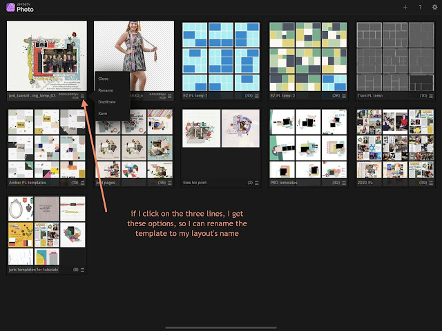
At one point when I'm clicking the back arrow to save my page, I'll use that opportunity to rename the file to my layout's name, usually when I've picked the title. You click the three arrows on the right of your page thumbnail and select rename from the choices. It brings up a box where you delete the characters that are there and replace with your title and select OK.
Once you're finished with your page, go up to the Documents icon and select Export. I usually save my print version first to make sure that gets done. My default screen comes up as 3600x3600 pixels (because that's the size of the template I started with) as a jpg and at 100% quality. Note the large file size, this should print out just fine. My naming system is that I add -p to my print size files. Then I click OK and save it in Files in a separate folder strictly for print files. That makes it easier to find when I'm ready to upload pages to Persnickety Prints.
I can also choose the Share option at the bottom left. This gives me the options to save in Files and Dropbox just like OK does but it adds many more choices. I could AirDrop to my iPhone, send it via message or email, save it to my camera roll or send to social media.
Next it's time for the web sized version. Same way, select Export, but now we'll change the 3600 size by either tapping and using the little calculator or swiping the circle (the calculator option is the easiest for precision). I'll select 600x600 as that's the size most used at The Lilypad. I'll also add -600 to the file name to denote a web version.
Then I would tweak the quality slider a bit, usually between 93% and 97%, to get the file size at the bottom less than 250kb. Then, click OK and save it in a separate folder called web size layouts. Having that separate folder makes it easier to find when posting pages to online galleries.
But as you'll notice in this example, I can't reduce my quality enough to get that size under 250kb. This doesn't happen often but often enough to need a workaround. One choice is using Flickr. I use Flickr as the method for hosting images to share in CT forums. But it does offer the option of sharing files via email with optional photo quality sizes. So I'll upload the print version to Flickr and go in and see if one of those options gives me a file size small enough.
Another option is to use the legacy Save for Web feature in Photoshop. For those that have scrapped for a while, we're used to having the opportunity to see the file size when saving. You access the legacy feature on a PC by clicking Cntrl + Alt + Shift + S. Now I'll reduce the height & width to 600 and tweak the quality slider. Voilà, a page we can post in a gallery!
If you're new to app scrapping I hope these beginner tips were helpful. Is there anything else you'd like to learn? I would probably like to learn it too!
_________________
Stacia


No comments:
Post a Comment
Note: only a member of this blog may post a comment.