
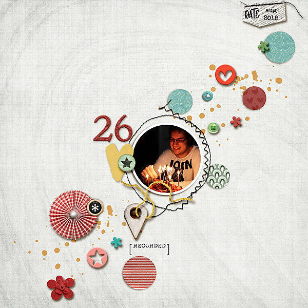
For a comparison, I have used this month’s BYOC from Pink Reptile Designs – You Can Do This! It is always great to use a template if trying a colour scheme or technique you are not confident with – it takes out one variable, so you can concentrate on extending yourself without worrying about composition. I firstly used a neutral background, which doesn’t look too bad but I think the photo appears a bit out of place.
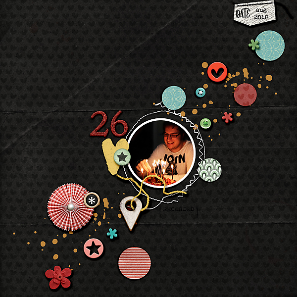
By swapping the white patterned background paper for a dark background paper, the photo suddenly becomes more prominent and I also love how the elements also pop.
Black and white photos also suit a darker colour scheme. Cynthia has also used this Month’s BYOC for her stunning page. How deep and rich do the red’s and greens look when placed on a black background?
Dark blue works equally well, Marilyn used Mirjam’s October BYOC Pure & Simple along with a vintage photo to rock a patterned dark background. Notice how well alpha’s stand out on a darker background. Light/ White/ silver alphas also are outstanding, brilliant for Christmas pages.
This beautiful page from Mirjam has a minimalist feel that suits darker papers so well - I do not have the discipline for such restraint, to my detriment! It also highlights that even keeping the same tones with a darker background can result in a very memorable page. Love this effect so much!
Also from Mirjam, a grey/pink/green combo- notice her vellum work, especially with the cutouts - so good! Vellum is much underused in digi land, such a standout on the darker papers. Again the white journalling is subtle but can be an element in itself. The page would appear to be unbalanced without it. So many good things to be inspired by here!
Lastly I have to highlight my very favourite kit from Pink Reptile Designs, A Slice of Lemon– I go to it again and again. It has a limited palette of black, white and yellow. To soften the plain black paper, I have used Gesso It 2 and paint splatters, balancing it with brighter patterned paper. To make the white journalling easy to read, use a bold text.
Just about all kits have dark papers included in them, so jump on in and make it a feature of your page. You will be surprised how often you will go to that option once you have given it a go!
No comments:
Post a Comment
Note: only a member of this blog may post a comment.