
Hello there scrapping friends. I'm back again this month with our new series Fun with Fonts where I'll share some quick tips and tricks for making the most of all those fonts I know you are hoarding! Last month we explored how to work with all those gorgeous glyphs that come with so many of our fonts. I hope you had a chance to play! This time I want to share a few other easy, quick tips to get your fonts to fit your layout better. Sound good?
OK. So ... you download a pretty new font and you start typing your journaling. You really love the look of it and it's just perfect all by itself, but when you look at it with all of the "other stuff" already on your page (such as your title and alphas, other fonts you've used, wordart, or just the overall theme/vibe of what you have created so far), you are left feeling not thrilled with the font after all. Something isn't quite right. Maybe it's the thickness or thinness of the font and the way it plays with the other alphas and fonts already on your page. Maybe it's the height or the spacing between the letters. Whatever it is that isn't working for you ... consider going back into that Photoshop Character Panel that we touched on last month. You can do a lot to alter your fonts even if there are no alternate font choices built in (i.e. Bold, Italic, Condensed, Thin, etc). You can easily change these things your self. Here's an example of what I am talking about.
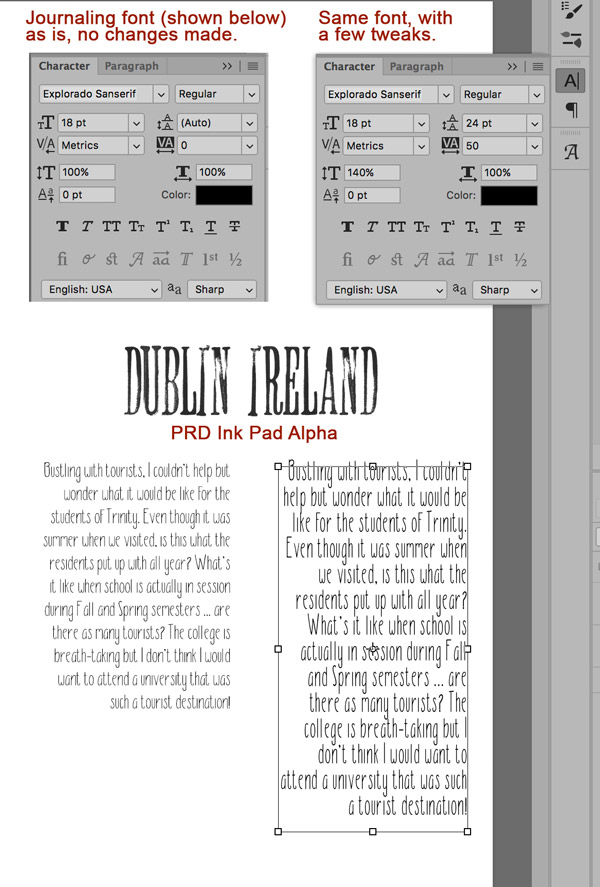
The journaling on the left is with Explorado Sanserif. I created my page with PRD's Ink Pad alpha for the sub title "Dublin Ireland" so I knew my page was going to have these beautiful stampy, tall letters. I thought the font would go great with it, but when typing out my journaling it did not have the impact I was hoping for. The font felt too short compared to the tall Ink Pad Alpha. So I went into my Character Panel window and played for a bit. The journaling on the right is the exact same font, with just a few minor tweaks made. I think it really plays well with the Ink Pad Alpha now. What do you think?
All I did was increase the font height from 100% to 140%. I changed the tracking to 50 - this gave each character some additional space. This also can be used with negative #s, so setting it to -50 will squeeze those characters together, instead of spacing them out. And then I just adjusted the leading to 24 pt - that is the space between the lines in the paragraph.
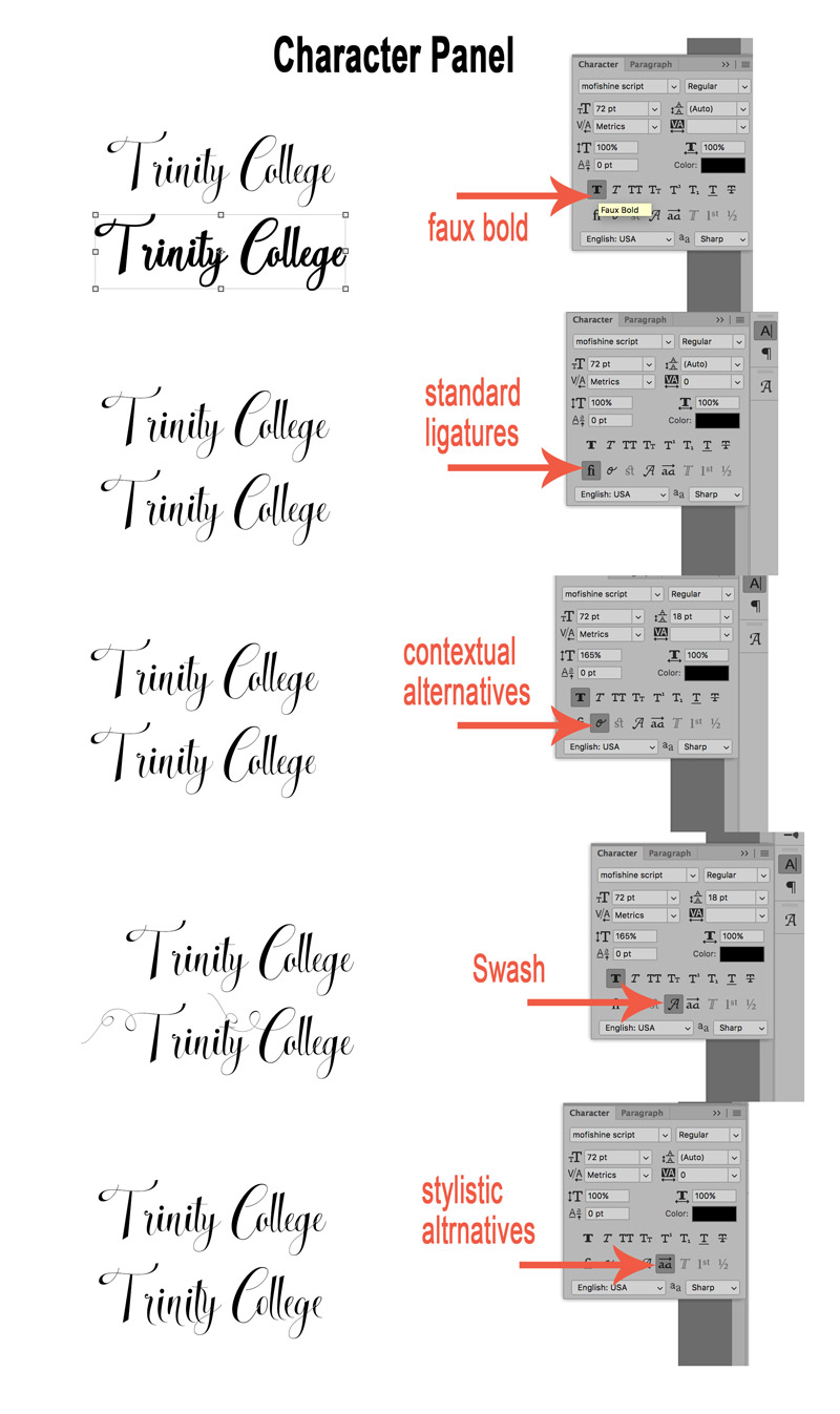
Other things you can do are: create a faux bold text. This is great if you are applying styles or making stickers from your fonts and the font does not include an alternate bold font. There's a faux italic option too.
The little "fi" and fancy "o" are pretty cool too! The "fi" is for standard ligatures which means that for certain character combinations, such as f and i, when they are typed next to each other in a word, the 2 separate characters are combined as one character so they connect better when typed. The f and i are very common, hence the reason "fi" is used as the button for this option. This prevents the dot in the "i" from sitting on top of the f's curve at the top. It just gives a more professional and polished look to the type. If the font includes this option, then "fi" will be available to select and you simply click to select it and click again to toggle it off. In the example below, you can see it lowered the first "l" in college a bit.
The fancy "o" is for contextual alternatives. This gives you some alternate characters and allows for better flow or joining of those characters within a word. Again if available for your font, you will be able to toggle it on and off. In my example, all it really did was give the ending "y" and "e" a little loopy curl on the tails. The "st" allows you to do the same thing, just individually as opposed to PS assuming which letters you want contextual alternatives for.
The fancy capital "A" will pull in an alternate letter (usually a capital letter) with a flourish or swash if available (alternate glyphs - like we discussed last month).
And finally the "Aa button with the line over" it will allow you to see alternatives available for the characters if available. See below:
There are quite a few other fun buttons and choices to play with as well, such as strike-through, super/subscript, small caps and all caps. Have fun exploring this versatile panel.
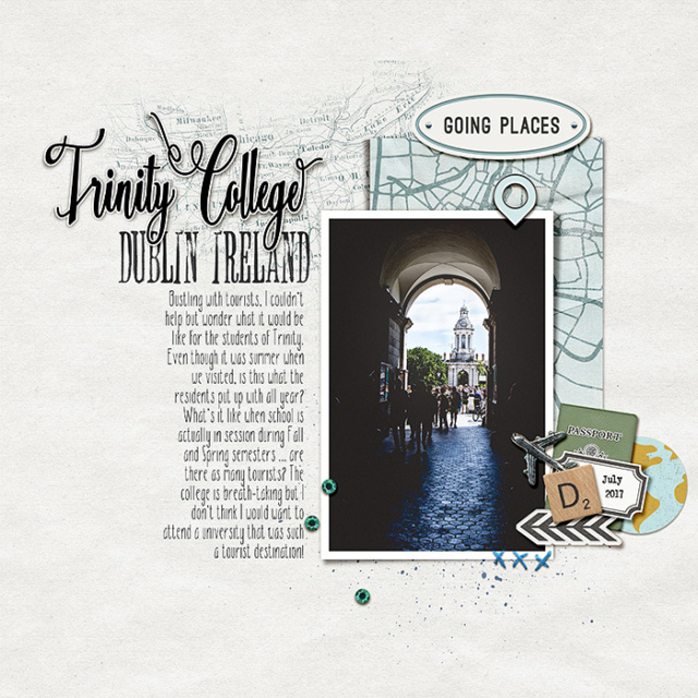
Here's my page with some fancying up of the "Trinity College" title using the options in the Character Panel and making those few small adjustments to the journaling font to better match the Ink Pad Alpha subtitle.
I hope you take the opportunity to play with all these fun options in your character panel to customize your fonts so they better match the look and feel of your layouts! Thanks for stopping by!
No comments:
Post a Comment
Note: only a member of this blog may post a comment.