
Hello Digi Friends! Today I have a brand new edition of my Three Way Series where we show you creative ways to use and stretch your stash. Today we are going to be playing with making things that sparkle and shine! It is December after all! And what better time than right now to add a little glitz and gold to some elements in our stash and dress them up for the holidays?
I went through my stash of PRD paper packs and found so many cute options for adding gold and metallics to dress up some of my elements. There's lots of pretty silvers too, if you prefer. Here's a peek at what I came up with:

Look at all these gorgeous silver and gold metallics in the C-Thru's 2 pack! Oh yes, these will be perfect for adding some shine to my ellies!

And the green metallic and rich gold papers in the Hipster Holiday pack will also be perfect!
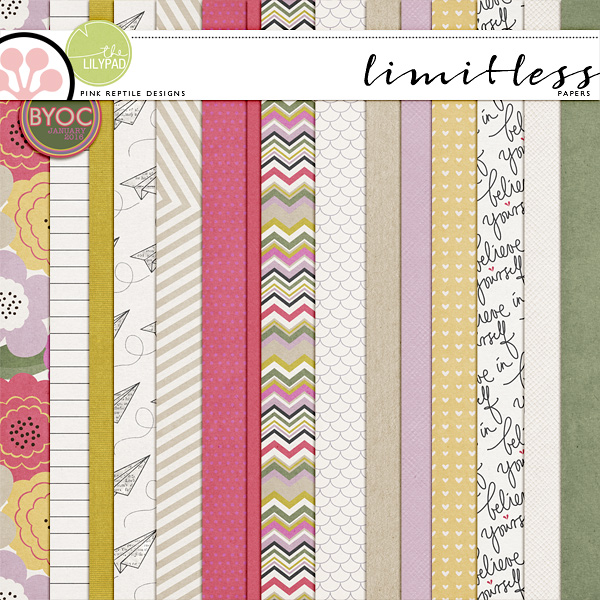
Sometimes you can also find unexpected treasures if you look closely. I found this rich gold solid cardstock in the Limitless paper pack. Another great option for adding some holiday glam!
So now that we've hunted through our paper stash, let's see how we can dress up some existing elements and get them ready for our holiday pages!
ONE.
The first way we are going to dress up our elements is to simply make a selection of a part of the element and then clip our sparkly & shiny papers to that selection. Here I have a few examples of how easy this can be. I have a stamp from the DYD 2016 | The Sparkly Season, two labels from Labels & Tags, and an ampersand from the If Only alpha. Here is how the elements look before:
*For the ampersand alpha, I placed the gold dot C thru vellum paper directly above the alpha. I used my magic wand tool (make sure contiguous is NOT checked) and clicked within one of the dots. This selected all of the gold dots on the paper. I then did Command + J (or CONTROL + J on a pc) and copied the selection of dots onto a new layer (since I only wanted the gold dots and not the vellum). Then I clipped those dots to the alpha. I think that little sparkle of gold looks so sweet on the kraft alpha!
*For the big round label, I used my magic wand tool (make sure contiguous is NOT checked) and clicked within the black area. This selected everything that was black on that label. I then did Command + J (or CONTROL + J on a pc) and copied the selection onto a new layer. I grabbed the big wide striped gold paper from the C thru paper pack and placed it so that the gold was completely covering all of the black parts of the label. I then clipped the paper to this layer. The beautiful texture of the gold paper shows up so nicely on that tag.
*Hint if you don't have any of these packs and still want to play along - you can always pick a great gold color and recolor some items. Take a gold object and sample the color from it with your color picker. Use this hex code color to recolor tags, labels and elements to give them a touch of glamour! I used this method on the smaller round tag.
Here's the elements dressed up in gold!

TWO.
The next method of
dressing up our elements with sparkle & shine is similar to the
first examples, but we will take it a step further and utilize blending options to retain the texture and "shape" of the underlying objects. I grabbed two letters from the Quicksilver alpha, a word art label from Mixed Emotions, a little present element from Woodybits Christmas, and will also use the ampersand from the If Only alpha again. Here is how the elements look before:
*For the metal alphas, I clipped the gold splatters to each letter. Here is the result:


*For the Woodybits present, there already is a touch of sparkle in the gold and green paint. But I thought it would be fun to give it just a push with even more shine. I used my magic wand tool to select the green areas (and made a copy so I could clip the metallic green paper from Hipster Holiday) and also used the magic wand tool to select the gold areas (and made a copy so I could clip the gold paper from C thru). The metallic green paper was set to Hard Light and the gold paper was set to Soft Light.
*For the ampersand alpha, I clipped one of the gold paint splatters to the alpha. It looked ok as is, but when setting the paint splatter layer to the Overlay blend mode, I was able to see the creases, texture and edge shadows of the alpha so much better. Here are the results:

THREE.
The last way we are going to dress up our elements is to create a fun, trendy gold dipped title with the All Eyes on You alpha. I've been wanting to do this with some of my alphas for awhile now, so let's get started. I wanted the date "2016" to be "dipped" in gold paint. I spaced out the individual numbers. Then I created a new layer to draw a shape on. I used the polygon lasso tool, holding down the shift key (to draw perfectly straight lines -even on an angle). You can see in the image below just how I chose to draw the shape, and then I filled it in with black using the paint bucket tool, like this:

I then clipped the gold C thru paper to the black shape making sure the gold completely covered all of the black area. I then merged the shape layer with the gold paper layer.

I made three copies - so I had 4 of these gold shapes in total (one to clip to each of my numbers). Move a gold shape layer copy above each of the individual number layers. Clip each gold shape layer to each of the numbers. As long as you don't accidentally move any of the gold shape layers ... this will create a perfect line of gold "dipped" paint across the 2016.
TIP: once you make the copies, link them together so one does not inadvertently move by accident. This would mess up the clean line across all of the numbers.
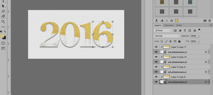
I chose for my gold "dipped" line to be on an angle, but you could draw your line straight across or even clip the gold paper layer to a fun drippy paint layer to make a drippy gold "dipped" title. That would look awesome too! Here's my final gold "dipped" 2016.

I hope you enjoyed this Three Way Series post and have some new ideas for how to stretch your stash! Have fun adding some sparkle and shine to your pages!
Thank you for the gold dipping tip! I'm going to have you try that!
ReplyDelete*to not you ;)
DeleteYou are welcome Monica!
ReplyDeleteGreat ideas! I really need to expand my knowledge of using the blend modes, so I'm going to bookmark this under techniques and try to incorporate your ideas, especially for alphas I have but hardly ever use. Thank you so much for sharing your stash-using creativity! :)
ReplyDeleteYou are very welcome Janice. So glad you found this useful - appreciate your sweet comment! :)
ReplyDelete