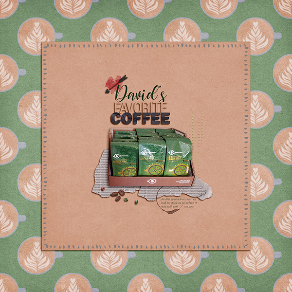
First I want to show you this coffee page by Keela. I love the cut out of the coffee packs and how it dominates the page, especially with the strong green color. It doesn't need much more than that.
Last but not least is this lovely page by Dady. The nice soft look of the papers and elements goes great with the photos. I love the blurred background on them and how only the couple is in focus. Absolutely stunning!
That's it for this month. If you want to be featured here on the blog make sure to post your layouts in the Pink Reptile Gallery.


No comments:
Post a Comment
Note: only a member of this blog may post a comment.