Hello scrapping friends! Hope all is well wherever in the world you are! I'm here today to share a little design inspiration with you. I'm always looking for interesting ways to fill my blank canvas and I hope you find some inspiration in today's post too.
While browsing Pinterest the other day, I came across a few pages that really caught my eye but I wasn't sure exactly why at first. And then it came to me. These three layouts had something in common. Asymmetrical balance!
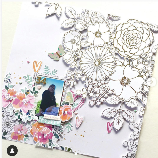
This first page by Virginia Walker (confessionsofapaperaddict) has an amazing display of florals that span the page on the diagonal - but what really drew me in was the way they were all white on one end and colorful on the other. Even the sizes of each floral display are different, but it works and gorgeously I might add!
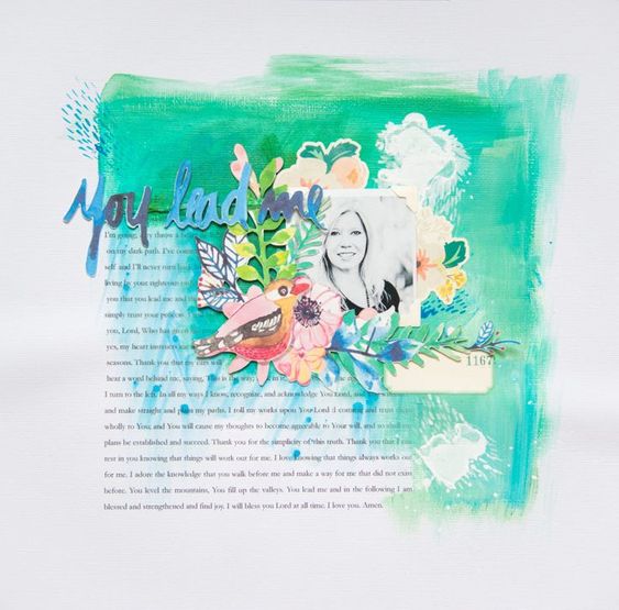
This next page is from iheartstudio.ca. I loved the beautiful painting filling the center square on the diagonal half and then the journaling as the opposite diagonal half. What a powerful design technique and the result is just simply stunning. I know I will definitely be giving this idea a try soon!
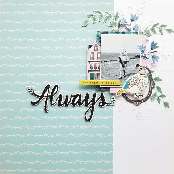
The last page is by Tina Stepanova. Even though everything is off center, including the paper division, the layout is balanced because that lovely large title fills the space as it extends into the left part of the page. It just helps balance everything out in a beautiful soft asymmetrical way.
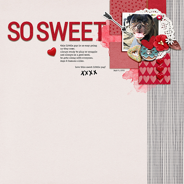
I only had time to try out one of these design tricks. I was thrilled to see that Mirjam even has a gorgeous template that is perfect to pull off this look! This template is found in the September BYOC collection Coffee O'Clock. All I did was add a paper to the background to achieve the look! Easy Peasy. Here's how my page came out trying this design tip:
page credits: Coffee O'Clock BYOC Collection by Pink Reptile Designs
Let us know if you give this asymmetrical balanced page design trick a try!


No comments:
Post a Comment
Note: only a member of this blog may post a comment.