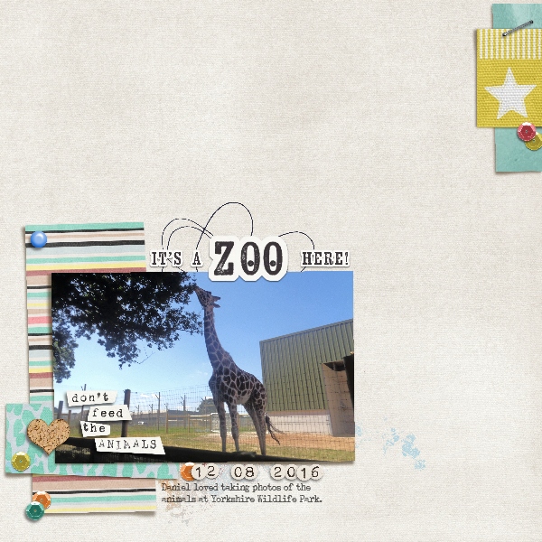
Sometimes less is more ... don't you agree? Like with this layout by Kate W titled "Zoo". She used the Lilypad August Template Challenge freebie for the bones of her page, but her choice of elements and papers is stunning. I love the way she increased the size of the word Zoo in her title. She skillfully placed some journaling strips over the less interesting part of her photo -- what a great way to use that negative space!
Zoo by Kate W
Next comes a lovely page by Lindzee titled "Dream" and that really describes her layout to a "T"! The monochromatic scheme has such a calm and soothing effect. I love that subtle touch of peach color in the background brush. The faint blending of the scene from her photo really extends the feel of the framed part. The heart stitching and the bottom of the photo anchors it perfectly to the page. The staggered, single elements lead the eye from top to bottom with time to linger in the center where the photo is. So pretty....
Dream by Lindzee
Last, but not least, is a layout by Vrielinkie titled "Hello Beautiful". Beautiful, it is! The template she used looks like an extension of the photo of a peacock. The paper colors and prints work so well together and they coordinate with the photo looking almost like tail feather. A few elements and paints help balance the circular look of the template. I love the pops of pink against the blue. Her page also shows how well Mirjam's designs work with those of other designers.
Hello Beautiful by Vrielinkie
I hope you've enjoyed my choices this month. Stop by the gallery for more inspiration and remember to post your pages in the gallery so we can enjoy them and leave you some love. Happy scrapping!


Thank you guys so much, what an honor!
ReplyDeleteI just now noticed how each layout has blue in it. Maybe I was in a "blue" mood when I picked them. Nah! They were all just BEAUTIFUL!!
ReplyDelete