Welcome to our second post featuring our brand new series, “It’s in the Details”, where we take a closer look at the uniqueness of Pink Reptile Design products, along with a little dose of inspiration for good measure. Won't you take a seat and follow along for a minute? Maybe it will inspire you to take a closer look at the Word Art in your stash and find new uses for them on your pages?
It’s in the Details | Word Art
Last time we talked about Pink Reptile Design products we took a closer look at the amazing textures and details found on Mirjam's flag banners, tiny tags and tabs. This time I want to highlight something that almost everyone in digi scrapping has used at one point or another : Wordart. I know some scrappers that really rely on Word Art because they are not fond of journaling on their own. Some scrappers use it as design elements. Others incorporate Word Art into their titles and journaling. I have personally used Word Art for all of the reasons above.
The Word Art found in the Pink Reptile Design kits are among my favorites. A lot of times I see Word Art that is simply a mix of fonts, and while it may be beautiful and the perfect touch to a given page, I really enjoy seeing the more handwritten and homemade Word Art included in a kit as well. I know I am getting a piece of Word Art that is unique and can't be replicated when a Designer takes their own hand to pen & paper (even if it is digi pen & paper!).
But don't just take my word for it, take a look at the A Slice Of Lemon Elements:
Every single piece of Word Art in this element pack has Mirjam's artsy touch, lovingly added. The "Random Snapshot" Word Art has a camera image and arrow. I just love it when designers add imagery to their Word Art pieces!!!! The "hello" & "Yes" are hand drawn. And the "This Moment" piece has a little heart and two different letterings combined. These pieces make our pages so much more unique in my opinion.
Meterr took the "This Moment" Word Art and just used the script "moments" as the title for her gorgeous page. She adds just a tiny bit of her own journaling for the subtitle and to finish off the story of the photo for her viewers.
And this page by Silent Ranks uses the "Random Snapshot" Word Art as the title in an elegant minimal page showcasing sweet photos of her littles caught sleeping in random positions and places. Perfection!
How about the Seriously? Elements :
This kit is filled with hand drawn words and a mix of different fonts, as well as hand drawn lines. These pieces, with the loopy letters & off centered angles, really pack a punch on your pages when used as design elements or as titles.
Here are some examples:
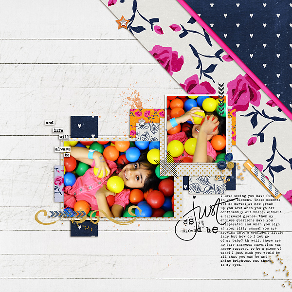
Shivani uses the loopy hand drawn "Just" and adds in her own lettering to create a custom piece of Word Art. She tucks it into a little nook on her page, right next to her journaling. Love that!
And Polly Keela's page features the Word Art as the title of her page in a bold and big way. With unique Word Art like this, it is hard not to make it a statement piece.
The Say Wha? kit is another super fun element pack with quirky and artsy Word Art. Every pice of Word Art has a matching drawn element. The pngs are separated so you can pick and choose what you would like to add to your page, but how amazing a designer is Mirjam to include these hand drawn images in her kit? I just love it!
Here are some inspiration pages featuring the Word Art and imagery of the Say Wha? kit.
Limoncello's page lets the photo of her daughter in the pool and the Word Art with the hand drawn fish tell the story. Nothing more is needed here, except maybe the date (which she includes). Beautifully scrapped.
And once again we have a page by Keela. I love how she places the Word Art and little sheep images together at the bottom center here. What could be more perfect than the sheep and these words paired with the sweet photos of her child sleeping. Adorable!
There are so, so many more examples of quirky, artsy unique Word Art to be found in the Pink Reptile Design kits. Pink Reptile Design's even has a whole category with just Word Art packs. You can find them all HERE. They are amazing, quirky, artsy and unique! I'll let you take a stroll through the Pink Reptile Designs shop at The Lilypad on your own at this point, while I run and get the April Blog Challenge ready for you. Please come back on the 15th to join us for a fun freebie and a brand new challenge!
But in the meantime, do you have a great page that showcases PRD Word Art? Please share! We’d love to see your creations and leave you some love!


No comments:
Post a Comment
Note: only a member of this blog may post a comment.