Lately I have rediscovered brushes – so often neglected in my standard Go To useful items. How often have we gotten an alpha with a kit and neglected the little .abr file that comes with it? More than I care to name in my case...
So I used my handy dandy search engine in the Pink Reptile Designs file and discovered to my embarrassment more than half a dozen brush files I hadn’t loaded into PSE yet. And then to challenge myself by using them as more than just a little highlight or for a title. And then had a lot of fun making background papers, some successfully some not so much but worth experimenting with, hopefully leading to expanding your stash.
The chief thing to remember is that the New Layer Button is your friend, use a new layer for every stamp you use – that way it is easy to delete a layer that doesn’t work or move it around as well. It makes everything much more versatile.
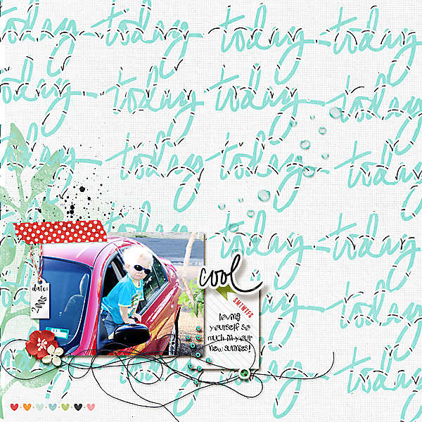
Firstly, keeping it simple, I chose the ‘today’ from the Word Up brush set and repeated it until it filled the page. Then clipped a paper onto it, I choose a paper that would not overwhelm the page with too a bold colour but still be readable and a feature of the page.
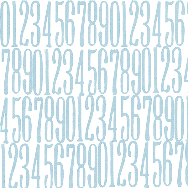
Any alpha or number set that you have would work just as well as Word Art. I made a patterned paper for my stash using the Ink Pad Alpha.
Again, I chose to clip a paper onto it rather than using the straight colour palette.
Then I had a play with Stamp It no.3 – going for a distressed but cohesive background this time.
Placing each stamp on a new layer, I built up a very simple background – set the brush size to as large as you can for easy coverage and using black as your masking colour - note the layers on the right - all turned off except for one layer and the background -
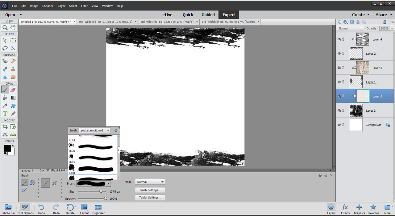
and with all layers turned back on
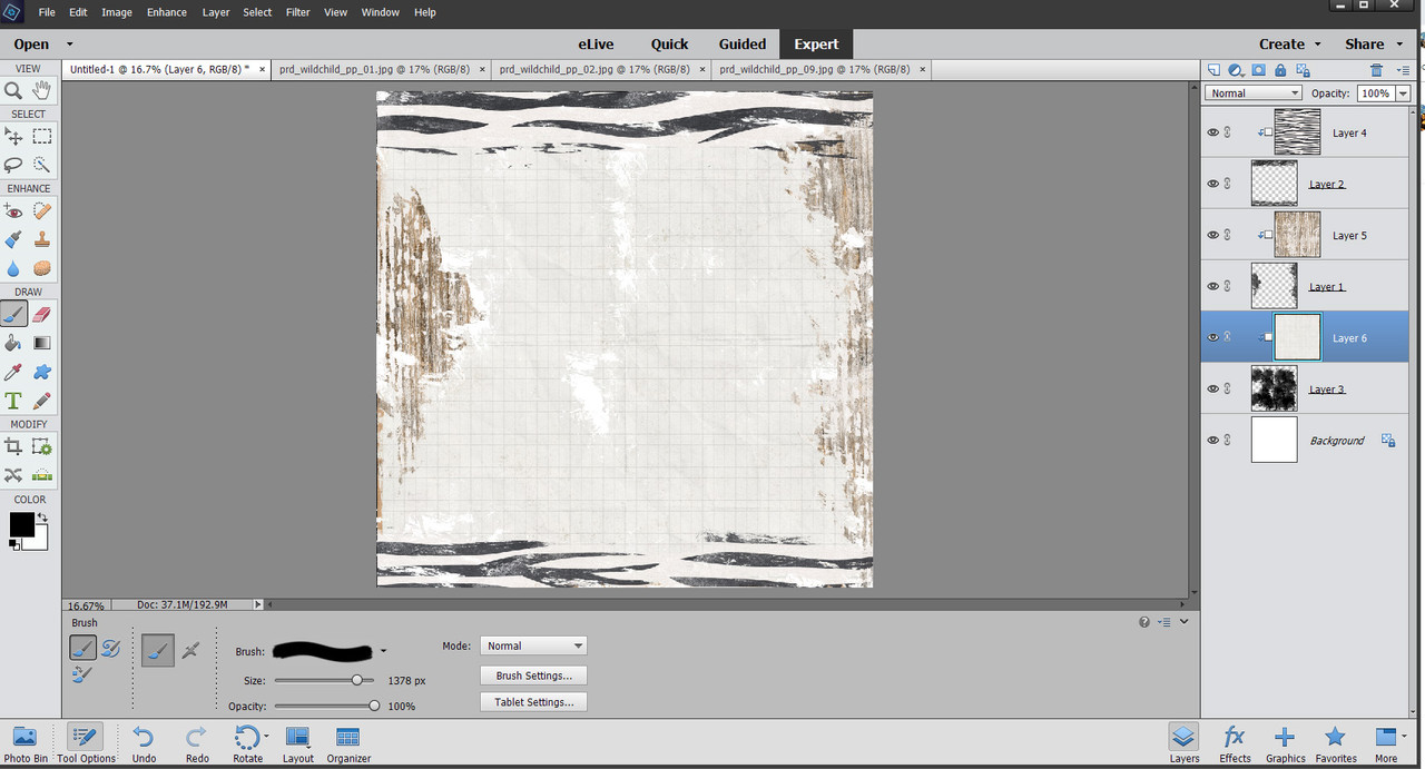
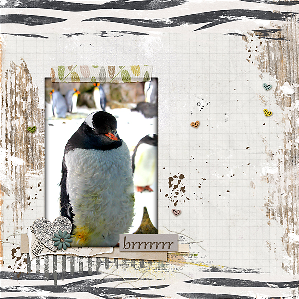
The stamps making the wonderful Wild Child Papers more rustic and blended. I like leaving gaps for a little of the plain white to shine through as well, a bit like well worn paper. Love the effect this has on the wood paper and the very cool zebra stripes.
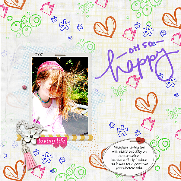
Lastly, one that I was initially unsure of the results but ended up liking the end page. This was stepping way out of my comfort zone with a bright and busy background. With the ScribbleDeeDo Brush set and using just the standard colour palette rather than clipping papers. Having the separate layers for a background was a necessity as I did a lot of rearranging and deleting. The subtle cross hatch brush’s opacity is dialed way back to soften the page and the photo is bedded on a neutral paint transfer to lend a calming factor to the page. Embellishments can be kept to a minimum on this sort of page as well.
So why don't you give it a go and extend your stash as well as pushing you creatively - it's a win- win situation!


No comments:
Post a Comment
Note: only a member of this blog may post a comment.