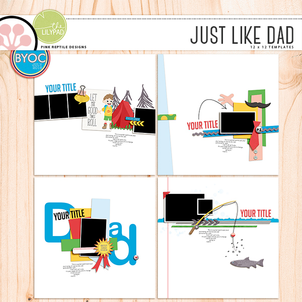
Today, we are going to talk about Mirjam's templates! They are an awesome addition to your stash! They are so versatile and can be used with any type of subject. Today, I'm going to show you how to simply use them for your pages in a way that you might not have tried. With a little mixing and matching, you might just end up with a page that you would have never tried!
First, here is a set that Mirjam released. Just Dad Templates

Such a great mix of templates and photo spots! Perfection!
Ok. You are going to open two of the templates. Then your next step is to copy all teh layers of Templates #2 onto Templates #1. You can do this by selecting the Background Layer, and scrolling all the way to the topmost layer, (don't click yet!). Then you will press the Shift Key, and clicking on that top most layer. Right click, and choose to Duplicate Layers. You will then choose a document to place those layers. For this example, you would pick Templates #1 that you opened.
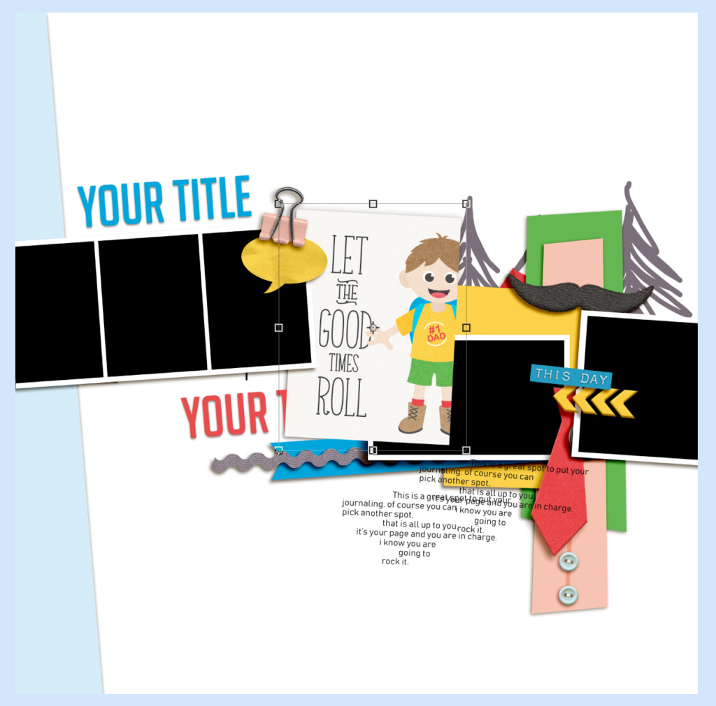
All of the copied layers from Template #2 are now on top of all layers of Templates #1. Now, the fist thing you need to do after combining templates, is removing the copied Background Layer. So, just scroll until you see "Background Layer" in the middle of the Layers Palette and then delete it. You will have a basic combined template.

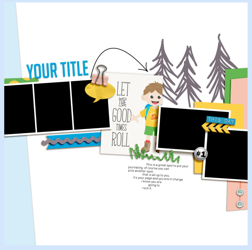
Now, you can go through from the top to the bottom, and click on the eye next to each layer to see if it's one you want to keep of one you want to delete. Pay attention to journaling and date boxes, as you wouldn't need both on your single page layout. After going through, here is my basic template. I did switch some things up, and moved some things, but that is normal for me!

I removed a few layers, a journaling spot, the tent, and some other elements. I left the journal card for now, only since I don't think this will be a Dad page, but more of a kid page. It's more of a placeholder at the moment.
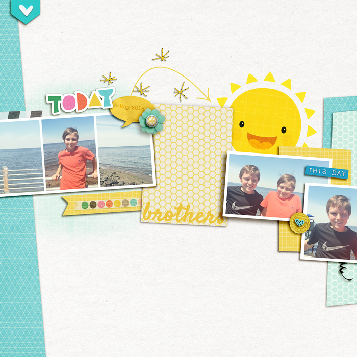
And here is the page that I created, mixing the two templates. Not too bad when mixing two templates, right? It's not something that i normally do, but it's fun to mix and match, and give yourself a totally new starting point!

Here's another sample of mixing 2 templates with the same pack. Rikki combined template nr. 2 en 3 to create this page.

Hope you enjoyed that simple and fun technique to get a jumpt start for your pages, and get more use out of the templates that you have already! Don't limit yourself from the same batch, combine from different sets! You'd be amazed how fun it is to mix them up!
Thanks for visiting!
Jenn (jk703)


Thank you so much for your tutorial! :)
ReplyDelete