Hello and welcome to the New Year. I hope your 2017 is off to a terrific
start. I love the promise of a new year with all the new goals and new
commitments that I am usually so eager and motivated to act on. Even if
things fizzle out by the end of the quarter (or even month), that energy
and excitement is addicting.
Another thing I find addicting is something I call “clustering with space” … I have been doing this on my digital pages for as long as I can remember and although sometimes I forget about this page design technique, I never tire of it. So I thought for this edition of our Three Way Series -where we show you creative ways to use and stretch your stash- I would share some tips and tricks on how I approach “clustering with space”. This is a great technique for those of you that simply love elements and want to use all.the.things on your pages or maybe a new approach to try out for those of you that usually love to do heavy dimensional clustering. I have three pages to share with you using this page design technique. It's such a great way to use all those elements that come in our kits!
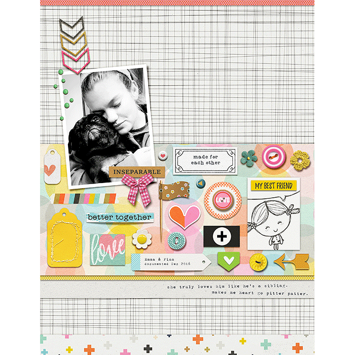
ONE Cluster along a Strip of patterned paper - Let the paper shape guide you in filling in this “spaced-out” cluster. If you are not sure where to start on your canvas with clustering elements that are “spaced-out” … try adding a strip of paper to your page. Use that rectangle shape as your guide in filling in the space with elements. Chose elements that are different shapes and textures and fill them in near each other but with some space in-between all elements so they are never touching. Hearts, buttons, word art strips, labels, tags and little paper die-cuts are so perfect for this. Try to incorporate some circles too!
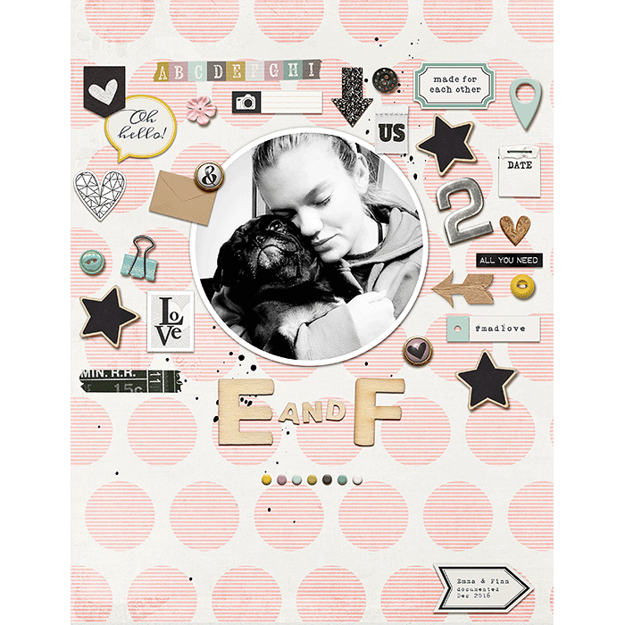
TWO Cluster around a big element or photo and fill in all the way to the edges - Incorporate a mix of dimensional items and flat items. This will add visual interest to your "spaced-out cluster" and make your page so much more special. Dimensional items can be as simple as a few sequins, buttons, and/or tiny brads. Don’t overlook using cork, wood veneer, metal objects and the like. Another idea is stay within a smaller color palette - like I did on my page below. It keeps the page more elegant and sophisticated.
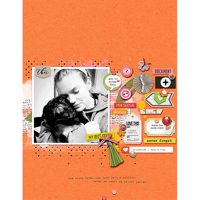
THREE Cluster on the side of a big element or photo to help balance your page - I love to place my photo (or photos) off to one side of my page a lot, but that often leaves a big gap of space on my canvas. So clustering with space is a great way to help fill up that white space and balance out the page. I usually start with the biggest element I want to use which often is some type of tag. Then work around that large element to fill in the gaps. Sometimes overlapping a few items can create a sweet look. Just be sure to leave space between the small cluster of overlapping items and the elements that are placed around/near it or you will lose that “spaced-out” cluster look. Banners, flag tags, little arrows and tiny shapes are ideal for this technique. Consider adding little bits of stitches too!
So that’s it for this Three Way | Clustering with Space idea. As always if you try this technique we would love to see what you create! May your year be filled with happiness and goodness … and lots and lots of scrapping!
Another thing I find addicting is something I call “clustering with space” … I have been doing this on my digital pages for as long as I can remember and although sometimes I forget about this page design technique, I never tire of it. So I thought for this edition of our Three Way Series -where we show you creative ways to use and stretch your stash- I would share some tips and tricks on how I approach “clustering with space”. This is a great technique for those of you that simply love elements and want to use all.the.things on your pages or maybe a new approach to try out for those of you that usually love to do heavy dimensional clustering. I have three pages to share with you using this page design technique. It's such a great way to use all those elements that come in our kits!
ONE Cluster along a Strip of patterned paper - Let the paper shape guide you in filling in this “spaced-out” cluster. If you are not sure where to start on your canvas with clustering elements that are “spaced-out” … try adding a strip of paper to your page. Use that rectangle shape as your guide in filling in the space with elements. Chose elements that are different shapes and textures and fill them in near each other but with some space in-between all elements so they are never touching. Hearts, buttons, word art strips, labels, tags and little paper die-cuts are so perfect for this. Try to incorporate some circles too!

TWO Cluster around a big element or photo and fill in all the way to the edges - Incorporate a mix of dimensional items and flat items. This will add visual interest to your "spaced-out cluster" and make your page so much more special. Dimensional items can be as simple as a few sequins, buttons, and/or tiny brads. Don’t overlook using cork, wood veneer, metal objects and the like. Another idea is stay within a smaller color palette - like I did on my page below. It keeps the page more elegant and sophisticated.

THREE Cluster on the side of a big element or photo to help balance your page - I love to place my photo (or photos) off to one side of my page a lot, but that often leaves a big gap of space on my canvas. So clustering with space is a great way to help fill up that white space and balance out the page. I usually start with the biggest element I want to use which often is some type of tag. Then work around that large element to fill in the gaps. Sometimes overlapping a few items can create a sweet look. Just be sure to leave space between the small cluster of overlapping items and the elements that are placed around/near it or you will lose that “spaced-out” cluster look. Banners, flag tags, little arrows and tiny shapes are ideal for this technique. Consider adding little bits of stitches too!

So that’s it for this Three Way | Clustering with Space idea. As always if you try this technique we would love to see what you create! May your year be filled with happiness and goodness … and lots and lots of scrapping!


No comments:
Post a Comment
Note: only a member of this blog may post a comment.