
Hello Friends! I am excited to kick off another year of our Three Way series with a clean, simple design trick : overlays! But since this is a Three Way post, we are not simply going to grab a bit of Word Art or a little border and plop it down over our photo. Let's jazz it up a bit and really create a bold statement, making our photo and the overall design shine on our pages!
Here's a peek at what I am going to be showing you in today's post.


For the first example, I took a black and white photo and added a rectangle block of color inside the photo area (I like this design better than the circle for my rectangular photo), but you can do this with any shape you'd like. I reduced the opacity to about 80%. I added a fun stroked border ... again a dotted or dashed line would be fun too. Get creative! And then I added my word art title using the Lobster font, a little dotted line and some extra text as a subtitle in Courier New Regular font.
Here's my page:


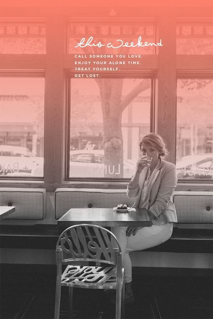
Now let's play with a gradient color overlay. This is another fun way to add a pop of unexpected color to a black and white image. I just made a box and filled it with a gradient that went from solid color to transparency and positioned it over the top 2/3s of my photo. I added a clean white frame and the same word art and dotted line as in the first example.
Here's my page:


And our third overlay design trick is probably my fave out of the three. It's a block of color but in a contrasting orientation than my photo shape. I reduced the opacity to about 75%. It covers part of the photo and gives us a place to add some text and design elements. Here's a tip though ... to really pull off this look you need to add some noise or grain to your block of color. If you have Photoshop simply use the Filter < Noise < add Noise feature (I went for a 10% value on my block of color). I added the noise to my black and white photo too! And I even went back to my second page (above) and added a bit of noise to the gradient color overlay because I really liked the look. In the first example, I left the rectangle clean with no noise.
Here's my page:

That's it for this Three Way series round up. I hope you are inspired to add a punch of color to your next photo!
excellent thanks for sharing!!!
ReplyDeleteWow, gorgeous article, great inspiration and pages, Jenn! Thanks for sharing! :)
ReplyDeleteLoved this Jenn. Am definitely going to try as soon as I get a breather from MOC!
ReplyDeletethanks ladies! me too Shivani - I think I need to do about 5 pages to catch up the TLP Month of Challenges. (this weekend??? hopefully???) :)
ReplyDeletegreat challenge, i used the gradient color overlay on the left picture
ReplyDelete[URL=http://the-lilypad.com/forum/galleries/chocolate.235501/][IMG]http://the-lilypad.com/forum/galleries/chocolate.235501/full[/IMG][/URL]
chigirl
boxjamm@yahoo.com