First, let’s learn a little about the drop shadow dialog box. This is the default drop shadow in PSCC:
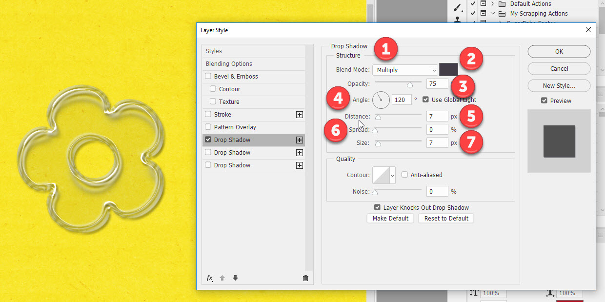
1. Blend Mode: how the drop shadow will interact with the layer below it
2. Shadow color: default is dark which will be a bit harsh
3. Opacity: the level of opaqueness
4. Angle: the lighting angle at which the shadow is applied. We all tend to develop a favorite.
5. Distance: how far between the item being shadowed and the layer below. The smaller the number, the closer to the background.
6. Spread: how far the base shadow spreads
7. Size: the amount of blur applied to the drop shadow
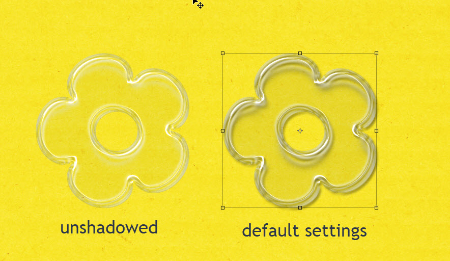
You’ll notice the default shadows are dark and muddy looking. The first thing you might want to change is the Blend Mode, probably to linear burn or maybe even color burn. This seems to decrease the gray cast but still preserving the clarity of the element. The next step would be to decrease the opacity below 50% and to change the shadow color either to a medium dark gray or brown or even to sample the layer underneath the acrylic element and choose a darker version of it.
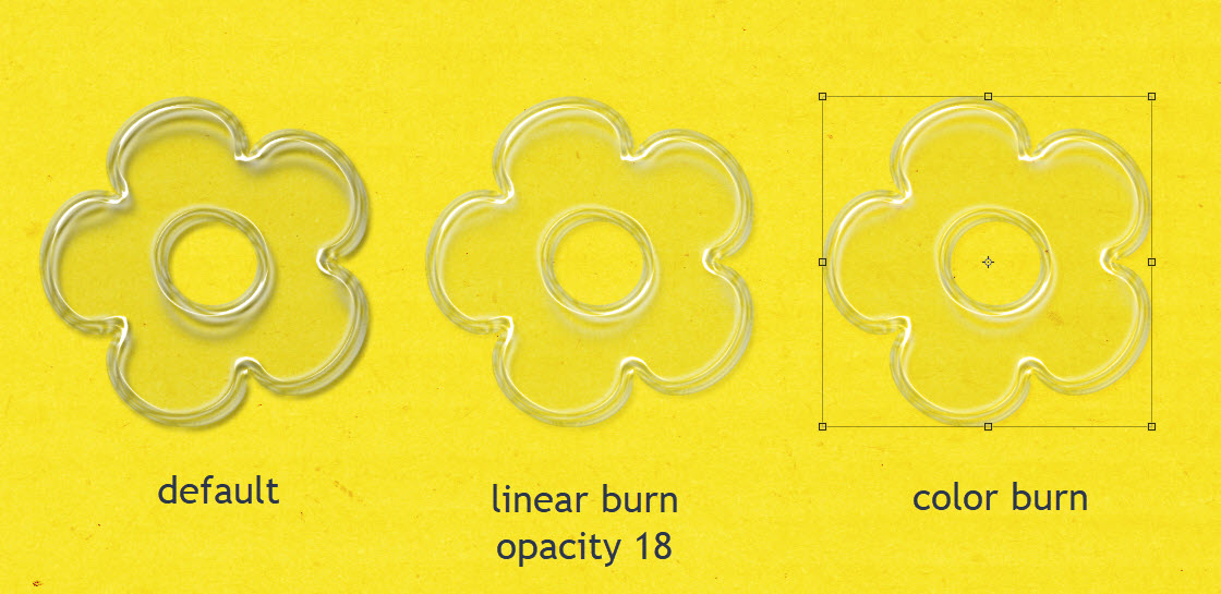
See how changing the blend mode reduces the gray cast and makes the paper below much more clear? I did have to reduce the opacity on the linear burn example to maintain clarity.
The next adjustments we might make are with the distance, spread and size. Too high of a distance and it will seem to float which isn’t what we are looking for. Having the size smaller than the distance can lead to nicer edges. In general, the thicker the acrylic element, the larger the numbers, thinner transparent elements like digital plastic pockets would have smaller numbers.
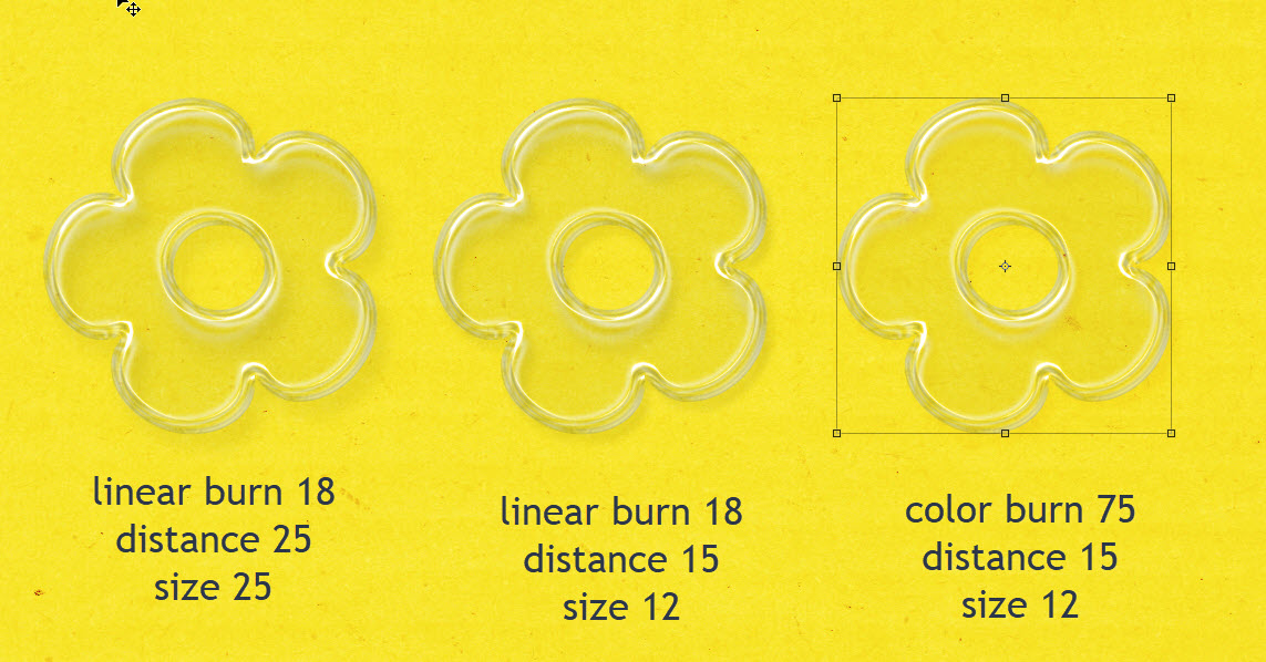
Now we’re cooking! The second two options are much more realistic than any of the ones demonstrated so far. This might be just enough to make you feel comfortable with the drop shadow on your clear acrylic elements. But we can try one additional thing to add a touch more realism.
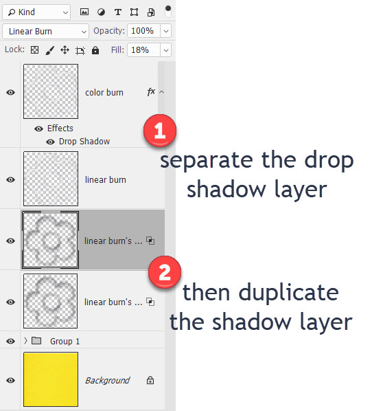
You’ll right click on the fx symbol on your clear element in the layers palette and pull down to Create Layer. This will separate the shadow layer from the element itself. Then, right click on the shadow layer and select Duplicate Layer or go up to the Layer pull down menu at the top of your screen. Both shadow layers should be below your element. The bottom one is going to be the outer shadow and the top one is going to be the inner shadow.
Then, you’ll ctrl-click/cmd-click on the thumbnail of the element layer. This brings up the marching ants. Then move your mouse down to the bottom shadow (outer shadow) layer in the layers palette and hit the delete key. This removes the shadow underneath the element and creates the shadow around it. Next, move your mouse to the top shadow (inner shadow) layer in the layers palette. This time we want to delete the area outside the element so we’ll select the Inverse (ctrl-shift-I or cmd-shift-I) or go up to the Select pull down menu and choose Inverse. Then hit the delete key. Ctrl-d/cmd-d to deselect. Feel free to adjust the fill opacity of one or both shadow layers to your liking.
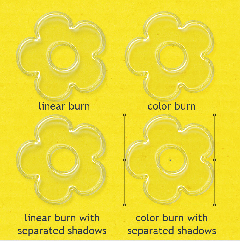
The difference is really subtle but it’s there. The bottom two flowers with the separated shadows are a little more clear.
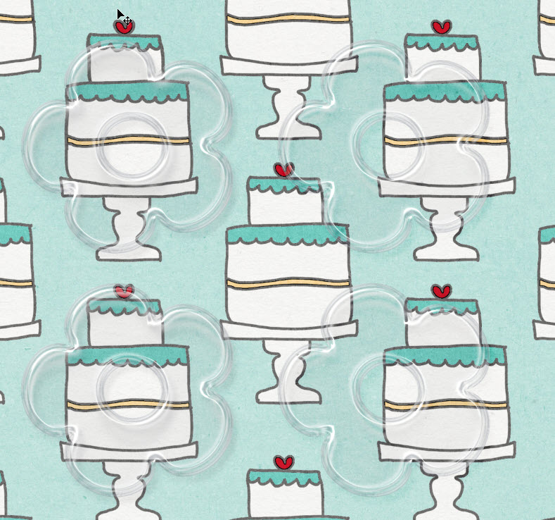
But what if your background isn’t solid? Does that change things? Absolutely, it might! Here are the same flowers on a patterned paper background.
At this point, it’s all up to personal preference. Your choice will depend on the element, perhaps if it is completely clear or has writing or words on it or even the size of the element itself to help you decide which blending mode, level of opacity and distance/size works for your page. Keep tweaking those settings until it’s just right! If you come up with a few favorites, consider saving them as custom styles so you can pull them up again. Or you could create an action for the shadow separation steps to make that part a bit quicker.
So what’s your favorite of the ones shown? Do you have a different shadowing method for clear elements that is your go-to? Share with us in the comments below.
thank you
ReplyDeleteБольшое спасибо!!!
ReplyDelete