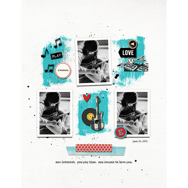
Hello Scrapping Friends! I have a brand new edition of my Three Way Series, where we show you creative ways to use and stretch your stash. Today we are going to be playing with paint strokes on our pages.
I've been inspired by the colors of summer lately. Everything is bright and in full bloom. So I thought why not find some ways to get bold color on our pages with paint. Are you ready to play with me? Let's do this ...
One tip is that when working with paint strokes from a kit ... remember that they are forgiving, meaning you can squish and squash them and it doesn't really distort them. Who's to know that you did that right? So go ahead and pull out the sides to make that paint stroke fit your needs. I give you permission! :)
Then I grabbed some watercolor flowers from Sing Like Nobody is Listening Collab, recolored them, and put a white background on them. I also grabbed a flowers stamp from Luv Ya Ma | Elements (recolored, made into a sticker) to really play up the punch of painterly color on my page. I love how bold this page is!
Watch this video to see how I made my pages in a more step by step way:
Pink Reptile Designs: Three Way Series | Paint Me Pretty from mirjam schurings on Vimeo.
So what do you think? Ready to go painterly on your next page?


Awesome tutorial! I seriously love all 3 ways and LO's!
ReplyDeleteThank you so much for the sweet comment. I am so glad you liked the 3 examples! :)
ReplyDeleteI really love this tutorial! What great ways to use paint!
ReplyDeleteThank you Tammy!!!
ReplyDeleteI absolutely LOVE this!! I usually have at least one that I want to try the most on your three way series, but on this one I can't wait to try all three! Thanks for sharing!!
ReplyDelete